Personal details redesign
Designing native personal details page
When a feature feels out of place, users notice. We took the challenge of reimagining personal details management, transforming it from a basic web wrapper into a thoughtfully crafted native iOS experience.
Timeline
This was my first project at Kindred, so I dedicated extra time to learning the processes. The entire redesign, including discovery, user testing, and concept exploration, took around 3 weeks.
Background
The previous version of personal details management was a basic web wrapper that lacked the fluidity and responsiveness of native iOS apps. We aimed to replace it with a fully native experience, aligning it with iOS design standards for better performance and user satisfaction.
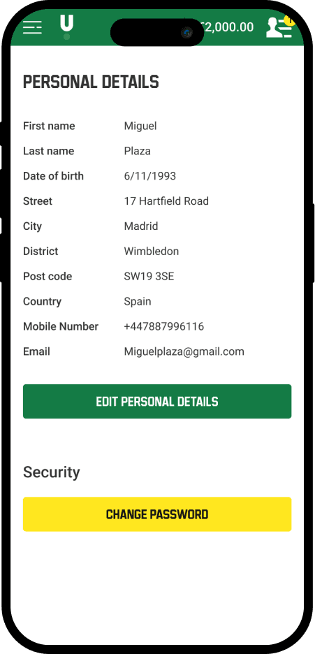
Previous version before the redesign
The result is more than just a visual upgrade - it's a complete rethinking of how users interact with their personal information. By embracing native iOS design principles, we created an experience that feels right at home on users' devices, making profile management feel effortless and intuitive.
Truly Native Feel
Replaced the web wrapper with native iOS components, making every interaction feel natural and fluid - from form fields to date pickers
Seamless Platform Integration
Leveraged iOS design patterns and behaviors that users already know and trust, reducing cognitive load and increasing confidence
Attention to Detail
Added subtle animations and transitions that make updating personal information feel less like a chore and more like a natural part of the app experience